In this article (10 sections)
- The 3-Second Rule: Clarity Is Your #1 Conversion Tool
- How People Actually Read Landing Pages (Hint: They Don't)
- Trust Signals: The Conversion Multiplier Above the Fold
- The Four Core Desires Every Buyer Has
- Visual Psychology: You Have 0.05 Seconds to Look Credible
- CTA Psychology: The Micro-Decision Framework
- The 7 Psychological Blocks Killing Your Conversions
- The 9 Non-Negotiable Elements of a High-Converting Landing Page
- Loss Aversion: The Most Powerful Conversion Trigger You're Probably Not Using
- The Bottom Line: Psychology Pays, Pretty Doesn't
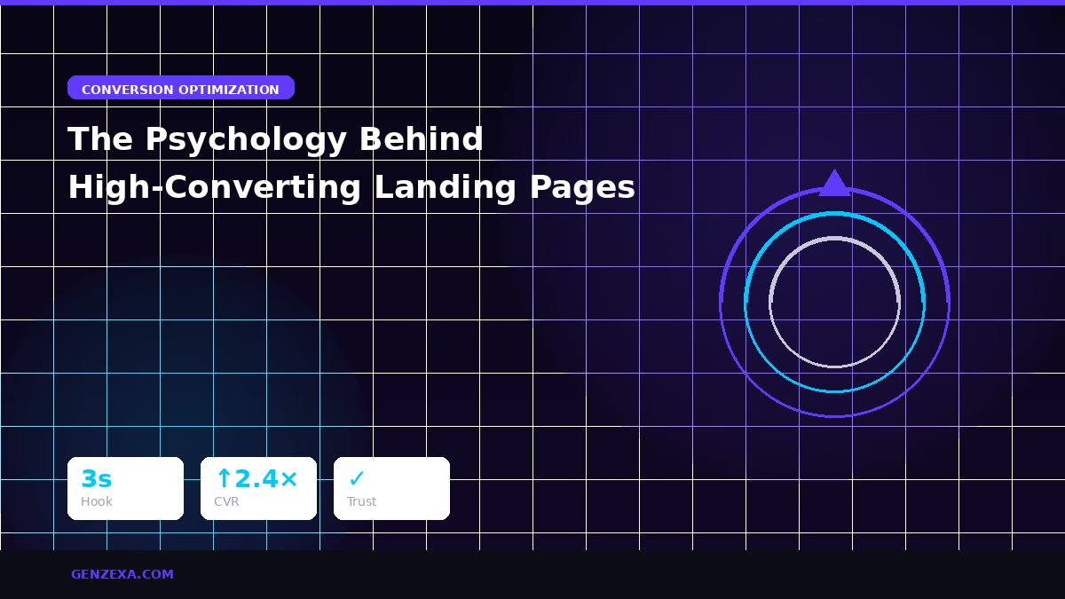
Your landing page doesn't need a redesign. It needs a psychology upgrade. Visitors don't convert because of how your page looks, they convert because of how it makes them feel in the first 3 seconds. Logic follows emotion. Design supports psychology. And psychology is what wins.
The 3-Second Rule: Clarity Is Your #1 Conversion Tool
The moment someone lands on your page, their brain is asking three questions simultaneously:
- What exactly is this?
- Why does it matter to me?
- What should I do right now?
If your page can't answer all three within 3 seconds, they're gone. No second chances. Clarity doesn't just beat creativity here. Clarity is the strategy. Speed beats aesthetics. Direction beats decoration. Every time.
"A confused visitor never converts. Clarity is the highest form of persuasion."
How People Actually Read Landing Pages (Hint: They Don't)
Your visitors aren't reading your page, they're scanning it. Eye-tracking studies consistently show the human brain jumps to specific elements first:
- Headlines and subheadings
- Bold or highlighted phrases
- Images and faces
- Numbers and data points
- Call-to-action buttons
- Short, punchy sections
Everything written in long, unbroken paragraphs? Ignored. If your landing page reads like an essay, your conversions will suffer like one too. Design for scanners first, readers second.
Trust Signals: The Conversion Multiplier Above the Fold
People don't buy from brands they don't trust. It's that simple. And trust must be established before the scroll, not buried at the bottom. Place these above the fold:
- Brand logos you've worked with, association bias works instantly
- Case study snapshots, proof will always beat promises
- Specific numbers and statistics, "helped 2,400+ brands" beats "we help many brands"
- Real testimonials with measurable results, vague praise converts poorly
- Photos of real humans, faces increase perceived trust and willingness to buy
No trust signals above the fold? Expect conversions to be cut in half. This is not an exaggeration, it's consistently measured across A/B tests.
The Four Core Desires Every Buyer Has
Every single person who lands on your page wants the same four things, whether they know it or not:
1. Ease
"Make my life simpler." Show them how effortless the experience is.
2. Speed
"How fast will I see results?" Address time-to-value explicitly.
3. Confidence
"Is this safe to buy?" Remove risk at every step.
4. Identity
"Is this made for someone like me?" Use specific, identity-driven language.
High-converting pages speak to all four desires. Low-converting pages address none of them. Review your current page copy against this framework, the gaps will be obvious.
Visual Psychology: You Have 0.05 Seconds to Look Credible
Research from Carleton University found that people form a visual opinion of a website in just 50 milliseconds. That's faster than a blink. Here's what their brain is reading in that window:
- Clean whitespace, space signals safety; clutter signals chaos
- Typography quality, messy fonts kill perceived trust instantly
- Image quality, high-resolution visuals trigger a premium bias
- Color psychology:
- Blue → Trust and reliability
- Black → Luxury and authority
- Red → Urgency and energy
- Green → Growth and health
Your design isn't decoration. It's the first layer of your sales argument.
CTA Psychology: The Micro-Decision Framework
Your call-to-action must feel like a small, safe next step, not a commitment. The moment it feels like a big decision, conversions drop.
CTAs That Convert:
- "Get the system", action-oriented, specific
- "See how it works", low commitment, high curiosity
- "Start your free trial", removes financial risk
- "Claim your spot", scarcity + ownership language
- "Watch the demo", soft entry point
CTAs That Kill Conversions:
- "Submit", cold, transactional, zero value
- "Contact us", vague and effortful
- "Buy now", too aggressive for cold traffic
- "Learn more", tells them nothing about what they'll get
Every CTA has one job: reduce friction and increase desire simultaneously.
The 7 Psychological Blocks Killing Your Conversions
Most landing pages bleed conversions at one of these seven psychological checkpoints. Identify yours:
Block 1: "I don't understand what this is"
Fix: Rewrite your hero headline in one clear, jargon-free sentence. If a 10-year-old can't understand it, rewrite it.
Block 2: "This isn't for people like me"
Fix: Use identity-based copy with hyper-specific language. Example: "Built for eCommerce brands doing $20K–$100K/month."
Block 3: "I don't believe these claims"
Fix: Add verifiable proof above the fold, logos, screenshots, data, real testimonials with names and results.
Block 4: "There's too much going on here"
Fix: Break copy into 2–3 line micro-sections with generous whitespace. Dense pages feel overwhelming.
Block 5: "What if this doesn't work for me?"
Fix: Add guarantees, money-back policies, free trial options, or live demo access. Eliminate perceived risk explicitly.
Block 6: "I don't know what to do next"
Fix: One primary CTA. Not three. Not seven. One. Repeated at the top, middle, and bottom.
Block 7: "This sounds too good to be true"
Fix: Balance big claims with context and mechanism. Result + how you achieved it = believability.
The 9 Non-Negotiable Elements of a High-Converting Landing Page
- Scroll-stopping hero, punchy headline, clear subheading, visual proof, single CTA
- "Who It's For" section, people convert when they feel specifically understood
- Pain-problem-insight block, call out their exact struggle before presenting your solution
- Your big promise, what specifically changes for them?
- Your process or framework, people trust systems more than vague claims
- Social proof wall, logos, testimonials, screenshots, and numbers
- Offer section, what they get, what it's worth, and why it matters now
- Objection handler, address "will this work for me?" directly and honestly
- CTA repeated minimum 3×, top of page, middle, and bottom
Loss Aversion: The Most Powerful Conversion Trigger You're Probably Not Using
Behavioral economists have proven it repeatedly: people are more motivated by the fear of losing something than by the prospect of gaining something of equal value. This is loss aversion, and when used ethically, it's one of the most powerful tools in your conversion arsenal.
- "Only 10 spots available this month"
- "Bonus expires Friday at midnight"
- "Prices increasing after launch week"
- "Don't miss the next cohort, 3 weeks away"
Urgency activates FOMO. FOMO sparks action. Action drives revenue. Use it honestly, manufactured scarcity backfires badly and destroys trust permanently.
The Bottom Line: Psychology Pays, Pretty Doesn't
You can have the most beautiful landing page on the internet and still convert at 0.4%. Because pretty doesn't sell. Psychology sells. Structure sells. Clarity sells. Proof sells. Friction removal sells.
When you understand how people think, what they fear, what they want, and what makes them act, your landing page stops being a brochure and starts being your best salesperson. Apply every principle in this guide, and watch your page stop leaking traffic and start printing customers.
Related reading: The Ultimate Guide to Website Development: Answering All Your Questions · Skincare case study: CRO-ready landing pages, 9.10x ROAS · Our conversion-optimized web service
Reading about it is step one. We can do it for you.
Tell us what you sell and what's holding sales back. We'll tell you straight if we're the right people to fix it.
See how our services work →